Fancy Fonts on Instagram: Bio, Username and Story Rules
Your Instagram bio and name field accept styled Unicode; your @username and Story text do not. Here is the rule for every field, and why.
Fancy text shows up as boxes — typographers call them "tofu" (□) — when the device displaying the text has no font glyph for those Unicode characters. The letters are perfectly valid Unicode; the box is just a placeholder a system draws when its fonts cannot render a character. It is a display gap on the viewer's side, not corrupted text, and the right styles avoid it almost entirely.
The empty rectangle is a real, named thing. When software is asked to draw a character its fonts do not cover, it falls back to a "missing glyph" placeholder — usually a box, sometimes a box with the character's hex code printed inside it. That placeholder has a nickname: tofu, because the little rectangle looks like a block of it.
The name is not slang we invented. Google built an entire type family to eliminate these boxes and called it Noto — short for "no tofu". Its own project FAQ spells it out: "the name Noto is to convey Google's goal that users see no more tofu." When the people whose job is fonts name a 1,000-language project after the problem, you know the box is a font-coverage gap, not a bug in your text.
So a box does not mean the text is broken, hacked or corrupted. It means one specific device could not find a picture for that code point. The underlying data is intact — paste the same string somewhere with better font coverage and it appears correctly, unchanged.
This is the core misunderstanding, and it is worth slowing down on. Fancy text is not a font you installed and not an image. It is ordinary Unicode characters that happen to look like styled letters — most of them from a single block, the Mathematical Alphanumeric Symbols (U+1D400–U+1D7FF), plus a handful of older ranges. The bold "𝐡" you copy is a genuinely separate character with its own code point, sitting in a different part of the standard from the normal "h" on your keyboard.
A code point existing in the Unicode standard only means it is defined — that the world has agreed "this number means this character." It says nothing about whether any given device can draw it. Two separate things have to line up before you see a styled letter: the character must exist (it does, always), and the font the viewing app reaches for must contain an actual glyph — a drawn shape — for it. The first never fails. The second is the entire ball game, and it is decided on the viewer's device, not yours.
That second step is why these symbols travel unevenly. They live in the Supplementary Multilingual Plane, a higher region of Unicode that older software and cut-down system fonts were slowest to cover. When the font reached for a character has no glyph there, the renderer draws tofu instead of refusing to display anything.
Because the choice of font is made per app, per device, every single time the text is drawn — and you control none of it. When an app meets a character its primary font cannot draw, it walks a font-fallback chain: it asks the next installed font, then the next, looking for one with a glyph. If some font on that device has the shape, you see the letter. If the chain runs out, you get the box.
That chain is different on a 2024 iPhone, a five-year-old budget Android, a smart-TV browser and a corporate laptop with locked-down fonts. So the very same copied string can render four different ways for four people, and each of them is "right" for their device. It also explains the oddest symptom — one letter boxes while the rest look fine. That single character simply fell off the end of the fallback chain on that device, while its neighbours were covered.
Support tracks the fonts shipped with each operating system and app. Newer, well-maintained platforms cover the common math-alphanumeric alphabets; older or deliberately locked-down ones do not. This table is a practical guide, not a guarantee — coverage shifts with every OS update — but the pattern holds:
| Where it is viewed | Box risk | Notes |
|---|---|---|
| iOS / iPadOS (recent) | Low | Strong coverage of bold, italic, script, double-struck |
| Modern Android (12+) | Low | Ships broad Noto coverage out of the box |
| Discord, major browsers | Low | Reliable in messages and display names |
| Older Android (pre-10) | Medium | Niche styles drop; common alphabets usually fine |
| Smart TVs, e-readers, kiosks | High | Minimal system fonts; many styles box out |
| Apps with a forced brand font | High | One font, no styled glyphs — even common styles fail |
The takeaway: a string can look perfect on your phone and show boxes on someone else's older device. That is not your text misbehaving — it is the font-coverage map of the real world, and you can plan around it.
Some Unicode ranges are far more widely supported than others, and the gap is large. The mathematical bold, italic, bold-italic, script and double-struck alphabets are among the oldest and most universally shipped, so they travel best across the devices above. Decorative or combining-heavy effects — the stacked marks behind layered cursed text or glitch text — are the most fragile, because they lean on combining characters that some renderers quietly drop or mangle.
There is a deeper reason the plain styled alphabets are a safer bet, and it comes from the standards bodies themselves. The W3C notes that these math symbols were encoded for mathematical notation, not as a general styling mechanism — which is exactly why their device support, while now broad for the core alphabets, was never guaranteed to be universal. Knowing that, the rule of thumb writes itself: reach for the well-established alphabets and treat the exotic stuff as decoration you test first.
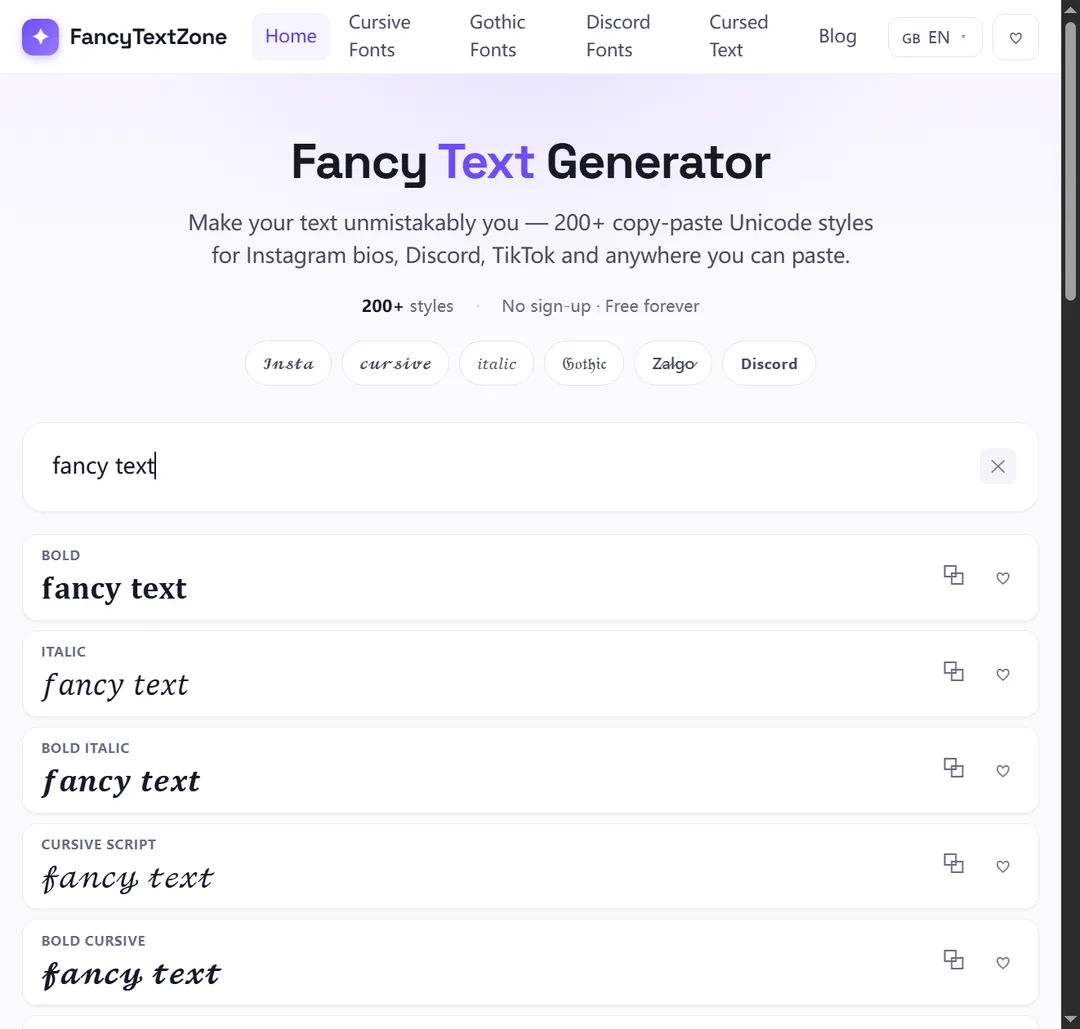
That is why every style on FancyTextZone carries a platform-safety label, and why the generator flags any letter with no styled equivalent before you copy. You can see at a glance whether a look is a safe bet for an Instagram bio or a gamble on older devices.
You cannot install fonts on someone else's phone, so the only real lever is choosing text that needs fewer of them:
Because the result depends entirely on the viewer's device, the only reliable check is to look at the text the way other people will. Three quick tests catch almost every problem before you post:
It sounds like effort, but it takes under a minute, and it is the difference between a clean post and one half your followers see as rectangles. For anything important — a launch, a pinned bio, a username people must read aloud — treat the second-device check as mandatory rather than optional.
No — and this is worth stating plainly, because the boxes make people nervous. Copying and pasting Unicode is lossless. The styled characters are just characters; they sit in the text field exactly like any letter, and removing them is as simple as selecting and deleting. They cannot infect a post, scramble a database or "break" a profile. The worst case is cosmetic: a box where a glyph is missing.
There is one honest caveat, and it works in your favour more often than against you. Some platforms run the text through Unicode normalization on input, which can fold certain styled characters back to plain letters — so your careful styling occasionally lands as ordinary text. That is a feature protecting searchability, not damage. Your original copy is untouched; only the platform's stored version was simplified. If you need the styling to survive, paste it somewhere that does not normalise, like a bio or caption rather than a username field.
Three things get muddled here, and separating them explains almost every quirk on this page:
Fancy text sits in the middle — portable like an image, selectable like text, and dependent on the viewer's fonts like nothing else. That trade-off is the whole reason this guide exists. For the deeper version of the "it is characters, not a font" point, see why some letters have no small or superscript form.
Not quite, and telling them apart saves you chasing the wrong fix. A box means the viewer's font lacked a glyph — a pure coverage gap. But people also report two other failures that look like breakage and are not. Some see your styled text arrive as plain letters: an app stripped or normalised the styling on input, which is what username fields do on purpose. Others — screen-reader users especially — hear it read out as "mathematical bold a, mathematical bold b", because assistive tech announces each character by its formal Unicode name.
Three different mechanisms, one shared source string. If you are specifically seeing rectangles, you are in the right guide. If the complaint is "it came through as normal text" or "my screen reader makes nonsense of it," the full breakdown is in why fancy text looks like gibberish to other people.
If you want one glance to plan around, here is how the popular looks rank for box risk — lowest first:
None of this is a reason to avoid the expressive styles — it is a reason to test them where it matters and keep them off the one handle people have to type.
If your problem is tied to a specific platform rather than a device, these companion guides go deeper. For Instagram, which fields accept styled text and which silently reject it: the Instagram bio, username and Story rules. For Discord, the split between handle, display name and nickname plus the 32-character trap: the Discord fonts guide. For the difference between a box and the other ways text degrades: why other people see gibberish. And if a single letter keeps refusing to convert, that is a Unicode gap, not a box — see why some letters have no small or superscript form.
To experiment with styles that show their platform-safety label up front and warn you about missing letters before you copy, open the FancyTextZone generator.
Your Instagram bio and name field accept styled Unicode; your @username and Story text do not. Here is the rule for every field, and why.
Styled text works in Discord display names, server nicknames and messages — but never in your new lowercase @username. And display names cap at 32 characters.
Small text and superscript come from incomplete Unicode sets — a few letters were simply never encoded. Here is which ones, why, and how a good generator handles the gaps.
The same styled text can reach others as boxes, plain letters, or a screen reader reading "mathematical bold a". Here is what is really happening and how to stay readable.