Why Does Fancy Text Show Up as Boxes (□)?
Those empty boxes are called "tofu". They appear when a device lacks a font for the Unicode characters behind fancy text — here is the full explanation, and how to avoid them.
Fancy text can look like gibberish to others because each device decides for itself how to render and read those Unicode characters. A missing font shows boxes; an app that strips styling shows plain letters; a screen reader announces each character by its formal Unicode name, such as "mathematical bold a". The data is consistent — the presentation is not.
When you copy fancy text, you are sending exact Unicode code points, not a picture. What the recipient sees depends on three independent decisions their system makes: which font to draw each character with, whether the app keeps or strips unusual characters, and how assistive technology reads them aloud. You control none of these from your end.
So the same string can arrive three different ways: styled (their font has the glyphs), boxed (it does not — see why fancy text shows up as boxes), or flattened to plain letters (the app normalised it).
This is the part most people never see, and it is the strongest reason to use styled text sparingly. Screen readers identify characters by their Unicode names. A normal "h" is read "h", but a mathematical-bold "𝐡" carries the formal name listed in the Mathematical Alphanumeric Symbols chart, so it may be announced as "mathematical bold h" — or skipped entirely if the reader has no entry for it. A whole styled word can become a slow stream of "mathematical italic" prefixes, which is genuinely hard to follow.
This is not a niche edge case the standards bodies overlooked; it is the documented downside of the characters. For accessibility, keep styled text decorative and short — a name or a flourish — and never put essential information (instructions, links, important words) in fancy characters only.
Some platforms run Unicode normalization or simply restrict input, which can convert or remove styled characters. Username fields are the clearest example: they reject styled Unicode by design, so your careful styling lands as plain text or is refused. This is the same mechanism behind Discord's lowercase username rule and Instagram's handle restrictions.
| What the other person gets | Cause | Means |
|---|---|---|
| Boxes (□) | Their font lacks the glyph | Device font gap |
| Plain letters | App normalised or stripped styling | Platform restriction |
| "Mathematical bold a"… | Screen reader announces Unicode names | Assistive technology |
You cannot control the recipient's device, but you can lower the odds of gibberish:
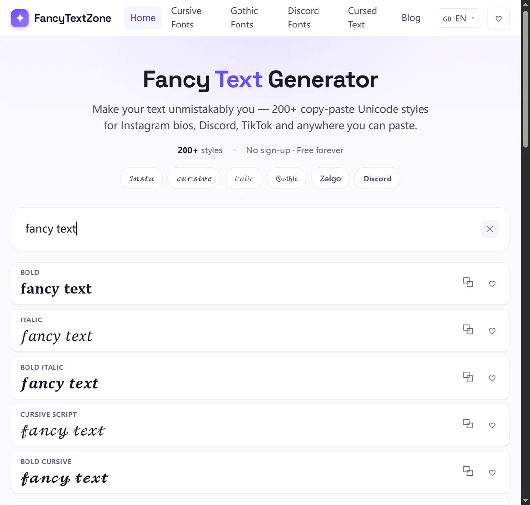
Our generator labels each style's platform safety and flags missing letters, so you can choose a low-risk look from the start.
Since you cannot control the recipient's device, the fix is to preview the text the way they will see it. Paste it into the actual destination — the real bio, message or caption box, not just a generator preview — and read it there. Then check it on a different system: if you wrote it on an iPhone, look on Android, an older phone, or a desktop browser.
The most honest test is another person. A friend on a different platform sees precisely what your audience sees, including boxes and stripped styling. For anything that matters, that thirty-second check beats discovering the problem in the replies. A generator's platform-safety label is a useful first filter, but a real second device is the proof.
Yes, and it matters more than most people expect. Search engines and on-platform search read the underlying characters, and styled Unicode does not match a plain-text query — someone searching your normal name may not find a fully stylised version. This is exactly the problem the W3C flags: using these math symbols just to pick a font "would create problems for searching, restyling (e.g. for accessibility), and many other kinds of processing." Some systems normalise the text back to plain letters; others simply fail to match. Either way, heavy styling in the words people search for can cost you visibility.
So keep names, handles, headings and anything you want found in plain text, and treat fancy characters as decoration around them. The same logic applies to links and instructions: a styled URL is neither clickable nor typeable. Used as a flourish rather than a wrapper for essential words, styled text looks good without quietly hurting how people reach you.
Fancy text is real, portable Unicode — but how it looks and reads is decided entirely by the viewer's device, so favour well-supported styles and keep anything important in plain text. Experiment safely in the FancyTextZone generator, and if you specifically see boxes rather than gibberish, start with why fancy text shows up as boxes.
Those empty boxes are called "tofu". They appear when a device lacks a font for the Unicode characters behind fancy text — here is the full explanation, and how to avoid them.
Small text and superscript come from incomplete Unicode sets — a few letters were simply never encoded. Here is which ones, why, and how a good generator handles the gaps.