Why Does Fancy Text Show Up as Boxes (□)?
Those empty boxes are called "tofu". They appear when a device lacks a font for the Unicode characters behind fancy text — here is the full explanation, and how to avoid them.
Some letters will not turn into small text or superscript because Unicode never encoded those specific characters. Superscript and small-capital alphabets were added piecemeal for phonetics and mathematics, not as complete A–Z sets, so a handful of letters simply have no styled form. A good generator substitutes the closest match or flags the gap rather than silently dropping the letter.
Unlike the mathematical alphabets, which were encoded as full A–Z and a–z sets, superscript and small-capital letters entered Unicode for narrow reasons — phonetic notation (the IPA), abbreviations and mathematics. They were added one character at a time, as scholarship needed them, not as a designed-to-be-complete alphabet.
The result is a patchy set. Most letters have a superscript or small-cap form; a few never got one because no standardised use ever required it. Open the Superscripts and Subscripts code chart and you can see the holes directly — the subscript letters, for instance, stop after a short, arbitrary-looking run. The broader Unicode code charts show the rest of these forms scattered across blocks like Phonetic Extensions rather than gathered into one tidy alphabet.
The exact gaps depend on the style, but the pattern is consistent: a small number of letters in each "small" or superscript style have no genuine character and have to be approximated. Historically the superscript set was incomplete for certain lowercase letters, and small-capital sets miss the odd letter too.
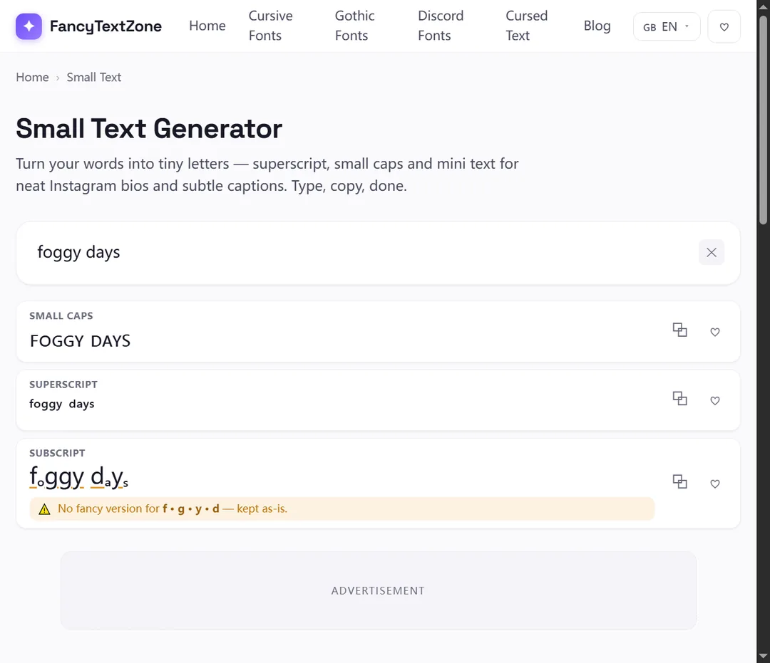
FancyTextZone handles this with a built-in substitution table covering 24 letters that have no native glyph in the affected styles. Where a true character is missing, the tool maps to the nearest visually consistent Letter-like character, so words stay legible instead of breaking. Our small text generator applies this automatically.
There are three possible behaviours, and only one is good:
That last behaviour is why our generator shows a missing-letter hint: you stay in control of words that contain a gap, instead of discovering a dropped letter after posting.
No. Like every style on this site, "small text" is a set of distinct Unicode characters, not a shrunk version of a font. Superscript "ᵃ" and small-cap "ᴀ" are their own code points with their own meanings (often phonetic), which is exactly why the sets are incomplete — they were never meant to be a full decorative alphabet. We cover this misconception in depth in why fancy text can look like gibberish to others.
Usually not, because the substituted characters are common Letter-like symbols with broad font support. The bigger risk is the opposite of a box: a silently dropped or mismatched letter that you do not notice. By substituting and flagging instead of dropping, the tool keeps words intact. For the separate question of styles that genuinely box out, see why fancy text shows up as boxes.
Beyond decoration, small text and superscript have a few genuinely practical jobs. People use superscript for footnote-style markers, ordinal endings (1ˢᵗ, 2ⁿᵈ), simple maths like x², and trademark-style marks. Small capitals give a quiet, refined emphasis for a name or a heading without shouting in full caps.
Because these are real Unicode characters and not document formatting, they survive a copy-paste into places that strip styling — a social bio, a plain-text note, a display name. That portability is the appeal: superscript built from these characters looks the same wherever Unicode is supported, unlike a word processor's superscript button, which only works inside that one document.
The gaps are not spread evenly. Superscript is the most incomplete of the common "small" styles, because its characters were borrowed from phonetics and mathematics rather than designed as an alphabet — a few letters simply have no superscript form. Small capitals are more complete but still miss the occasional letter. Subscript is the most limited of all: only a handful of lowercase letters were ever encoded, which is why a subscript word so often comes out half-converted.
The fully complete alphabets — the mathematical bold, italic, script and double-struck sets in the Mathematical Alphanumeric Symbols block, used for most Instagram and Discord styling — have no gaps at all, because they were encoded as whole A–Z and a–z ranges in one deliberate pass. If you need every letter to convert cleanly, reach for those; if you specifically need small or superscript, expect the odd substituted letter and re-read the result before you post it.
It helps to know where the holes are before you type, so here is how the styles in our small text generator actually behave — based on what Unicode encodes and what the tool does about the gaps:
| Style | How complete | What happens at a gap |
|---|---|---|
| Superscript | Most letters; a few have no true form | Closest Letter-like character substituted, then flagged |
| Subscript | Digits 0–9 complete; only some letters (b, c, d, f, g, q, w, y, z have none) | Missing-letter hint shown so nothing is dropped silently |
| Small capitals | Nearly complete; odd letters use Letter-like stand-ins | Mapped to the nearest small-cap shape |
Subscript is the one to watch: because so many lowercase letters were never encoded, a word like "by" or "fog" cannot convert cleanly and will lean on substitutes. The generator never deletes a letter to hide a gap — it substitutes the closest match and tells you, so you decide whether the result reads the way you want.
When you need clean small text or superscript, generate it with the small text tool, watch for the missing-letter hint, and re-read the result to confirm a substituted letter reads the way you want. For a tidy look, words built mostly from the well-covered letters convert most cleanly — and if a word leans on the subscript gaps above, a quick reword often beats a row of substitutes. The same incomplete-alphabet quirk shows up elsewhere too, including in upside-down text, where the turned-letter set has gaps of its own.
Those empty boxes are called "tofu". They appear when a device lacks a font for the Unicode characters behind fancy text — here is the full explanation, and how to avoid them.
The same styled text can reach others as boxes, plain letters, or a screen reader reading "mathematical bold a". Here is what is really happening and how to stay readable.