Why Does Fancy Text Show Up as Boxes (□)?
Those empty boxes are called "tofu". They appear when a device lacks a font for the Unicode characters behind fancy text — here is the full explanation, and how to avoid them.
Upside-down text is not your letters physically rotated. It is a substitution trick: each letter is swapped for a different Unicode character that happens to look like the 180°-turned version, and the whole word is reversed so it reads correctly when flipped. Many of those lookalikes are real phonetic letters borrowed from the alphabet linguists use. It is not a font and not an image, which is why "uʍop ǝpᴉsdn" pastes anywhere — but it also explains why it can break.
When a generator hands you flipped text, nothing about your original letters has been rotated. Two separate things happened. First, every character was mapped to a different Unicode character chosen because it resembles your letter turned upside down — an "e" becomes "ǝ", an "a" becomes "ɐ". Second, the order of the whole string was reversed, because once each letter is flipped, the line also has to run the other way to read correctly when you turn your head (or your phone).
So the output is a brand-new sequence of characters that only looks like your sentence standing on its head. Nothing about it is a font or an image; the flipped line is simply more code points, so it rides along inside any text field that accepts Unicode.
Some letters are easy: they are already each other's rotations. As the overview on text transformation notes, "pairs such as b/q, d/p, and n/u are rotations of each other" — flip a "b" and you essentially have a "q". Those come for free.
The rest have no natural partner, so generators borrow from the phonetics. A lot of the turned letters live in the Unicode IPA Extensions block, where characters are literally named things like "latin small letter turned a" (ɐ) and "turned e" (ǝ) — encoded for linguists writing pronunciation, then repurposed here because they look like flipped letters. Capitals are harder: fewer of them have a natural turned lookalike, so generators pull turned capitals from a scatter of blocks (the Lisu/Fraser range among them), and older flippers simply left capitals upright. Our weird text generator assembles all of this for you — map each letter, fill the gaps with the closest turned character, and reverse the line — in one step.
A lookalike, and it is worth being honest about that. None of these characters is your letter rotated; each is a separate symbol that resembles the turned shape. A few are near-perfect (ǝ for e), others are loose approximations, and a handful of letters have no good turned form at all, so the result reads as "close enough" rather than pixel-perfect.
If you genuinely need a letter or word rotated exactly — for a logo or a graphic — that is a job for an image or a CSS rotation, not Unicode. The trade-off is the usual one: a real rotation looks identical everywhere but is not text, while this Unicode version is selectable, paste-able text that depends on the reader's device to render each borrowed character. That dependency is where the problems start, below.
Because the turned alphabet is a patchwork, not a designed set. A generator is hunting for a character that looks like each flipped letter, and sometimes the closest match is only approximate — or, for some capitals and symbols, missing entirely. When nothing fits, a good tool keeps the original character rather than dropping it, so you may see one upright letter in an otherwise flipped word.
The turned alphabet was never planned as one set — linguists added the characters they happened to need for writing pronunciation, so its coverage is uneven by accident rather than by design. You can see the same unevenness, for a different reason, in the gaps behind letters with no small or superscript form.
| Where you paste it | How it fares | Why |
|---|---|---|
| Social bios & captions | Usually fine | Accept Unicode; a fun novelty line |
| Comments & chat messages | Mostly fine | Free-text fields render the characters |
| Older or stripped-down devices | Patchy | Phonetic characters ship in fewer fonts than common styles |
| @usernames / handles | Never | Handles take ASCII only, so the turned letters never stick |
| Anything searched or read aloud | Avoid | Not matched as words; screen readers misread it |
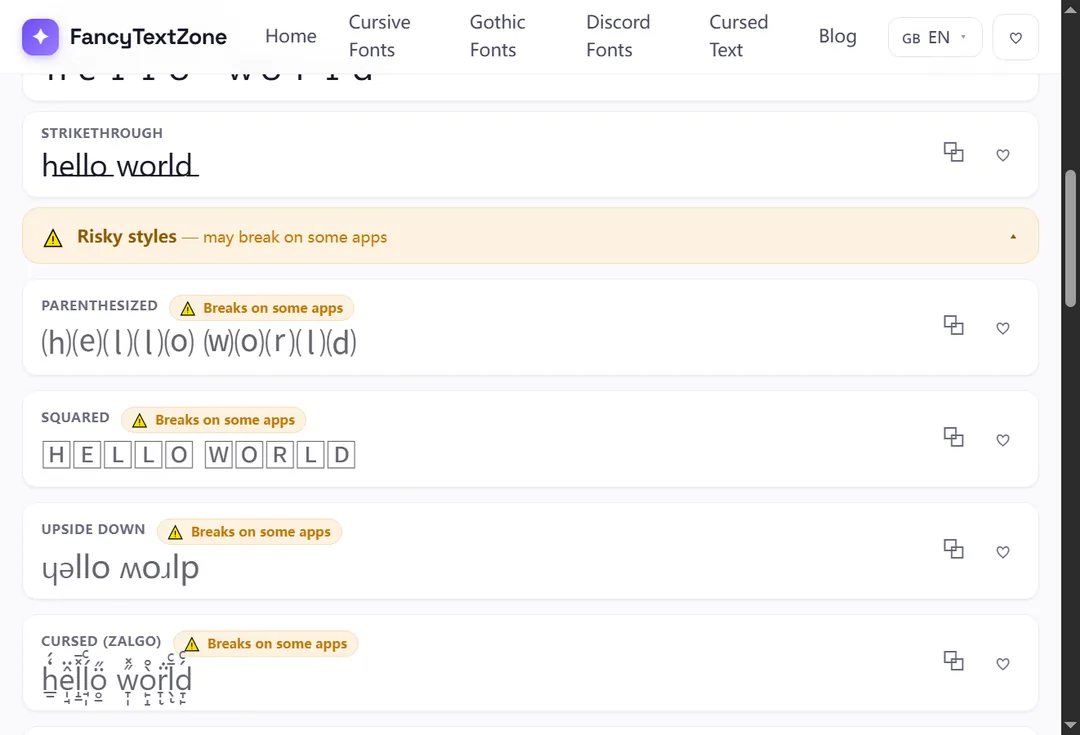
Upside-down text is more fragile than the popular script and bold styles, for one specific reason: the turned characters come from niche phonetic ranges that older or cut-down device fonts do not always cover. It is brilliant for a one-off novelty caption; it is a poor choice for anything that has to be read reliably by everyone.
Two reasons, both rooted in what these characters really are. On a device whose fonts do not include the obscure phonetic glyphs, the missing ones render as boxes (tofu) — more likely here than with mainstream styles because the source characters are less widely shipped. And to assistive technology, a flipped word is a string of phonetic symbols, so a screen reader announces them by their formal names instead of reading your sentence, which is part of why fancy text can read as gibberish to others. The W3C warns more generally that pressing characters like these into service in place of a real font undermines searching and accessibility alike — and upside-down text, stitched from repurposed phonetic letters, is a textbook case. Keep it decorative, and never hide anything important — a link, a handle, an instruction — inside it.
Open the weird text generator, type your words, and copy the upside-down result — the tool flips each letter and reverses the line for you, so it reads correctly when turned. Paste it into a bio, caption or comment for a novelty effect.
A few sensible limits keep it from backfiring. Use it on short text — a phrase reads as playful, a whole paragraph reads as broken. And keep a plain version of anything people actually need to act on, because a flipped string cannot be typed back or searched for.
Upside-down text is one corner of a bigger picture. If parts of it arrive as empty rectangles, why fancy text shows up as boxes explains the font gap behind it; if it reaches people as plain or garbled text, why fancy text looks like gibberish covers the rest. To flip your own words and watch the trick happen, open the weird text generator.
Those empty boxes are called "tofu". They appear when a device lacks a font for the Unicode characters behind fancy text — here is the full explanation, and how to avoid them.
Small text and superscript come from incomplete Unicode sets — a few letters were simply never encoded. Here is which ones, why, and how a good generator handles the gaps.