Why Fancy Text Looks Like Gibberish to Other People
The same styled text can reach others as boxes, plain letters, or a screen reader reading "mathematical bold a". Here is what is really happening and how to stay readable.
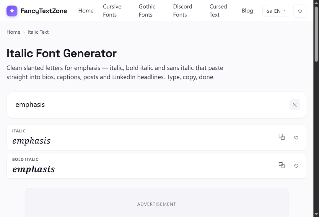
Italic text is slanted lettering, used for emphasis or a touch of style. But online, "italic" means two genuinely different things. Real italics are your ordinary letters re-drawn at a slant by the app or by CSS — and they carry meaning, like the stress in "I said now". Unicode italic (the copy-paste kind, 𝑖𝑡𝑎𝑙𝑖𝑐) is a set of separate characters that only look slanted and carry no emphasis at all. Knowing which one you are using determines whether it helps or quietly hurts you.
They solve different problems. Real italics are a restyling of normal text: when you press the italic button in a document, or a page wraps a word in an emphasis tag, the underlying letters stay the letters "i-t-a-l-i-c" and only their appearance tilts. Per MDN's reference, the emphasis element even changes how the words are spoken — "a person or software reading the text would pronounce the words in italics with an emphasis" — and purely visual slanting is a job for CSS, not for swapping characters.
Unicode italic works the opposite way. It does not restyle your letters; it replaces each one with a different character that happens to be drawn on a slant. That is the only way to get a slanted look into a plain-text field like a social bio, which has no italic button — but it means the result is not really "italic" in any meaningful sense, just lookalike characters. Our italic font generator produces this copy-paste kind, in serif, bold and sans-serif slants.
No — and that is the heart of it. The slanted letters you copy come from the Mathematical Alphanumeric Symbols block, which holds full italic, bold-italic and sans-serif-italic alphabets. They were encoded for mathematicians, who write variables in italic by convention, then borrowed for decoration. Because they are real characters rather than a font setting, they survive a paste into a bio or a chat — but they also depend on the reader's device having glyphs for them, and they bring none of the meaning real italics carry.
The right choice comes down to where you are typing. This is the trade-off, side by side:
| Real italics | Unicode italic | |
|---|---|---|
| What it is | Your letters restyled (CSS / italic button) | Different characters that look slanted |
| Carries emphasis? | Yes — read with stress by screen readers | No — purely visual |
| Searchable / selectable as words? | Yes | No |
| Works in a plain-text bio? | No (no italic button there) | Yes |
| Best for | Documents, articles, anywhere with formatting | A decorative slant in fields that strip formatting |
In short: in a document, email or web page, reach for real italics — they mean something and stay editable. In a bio, username field or chat that offers no formatting, Unicode italic is the only way to slant text, but treat it as decoration, not emphasis.
Here is a genuine quirk. When Unicode encoded the mathematical italic alphabet, the italic small "h" was left out — because the character had already been encoded years earlier as "ℎ" (U+210E), named PLANCK CONSTANT, the ℎ physicists use in equations. Rather than encode a duplicate, the standard reuses it, so the italic "h" you copy is, formally, the character named PLANCK CONSTANT.
It is a charming piece of trivia, but it is also a working example of how this site's styles are assembled: when a needed letter already exists elsewhere in Unicode, a correct generator points at that real character instead of dropping the letter. It is the same instinct behind a few odd small and superscript letters: when a character already exists somewhere in Unicode, the standard points at it rather than adding a twin.
It can, and this is the part worth taking seriously. Because Unicode italic is symbols rather than letters, it brings none of the emphasis that real italics carry — a screen reader will not stress the word, and may instead announce each character by its formal name (that italic "h" can be read as "Planck constant"). Search is no kinder: the W3C points out that characters pressed into service as a font this way undermine searching and — pointedly — restyling for accessibility, none of which a row of math symbols can do.
So if your goal is genuine emphasis — stressing a word so it is read and understood that way — Unicode italic is the wrong tool; real italics (or just clearer wording) do the job. Spend Unicode italic on decoration, and let your name, your headings and anything that has to be found or heard stay in ordinary letters.
When you genuinely cannot use real italics. Plenty of fields — an Instagram or TikTok bio, a display name, a chat without formatting — accept only plain Unicode, with no italic button in sight. There, the copy-paste kind is the one way to add a slant, and a lightly italic bio line reads as tasteful rather than shouty. Italic is also one of the better-supported decorative styles, so it boxes out less often than the exotic ones.
The rule of thumb: if the place you are typing has an italic button or accepts formatting, use that; if it only takes plain text and you want a slant anyway, Unicode italic is fine — as a decorative flourish, never as the carrier of something important.
For a plain-text field, open the italic font generator, type your words, and copy the slant you want — serif italic for a classic look, bold italic for weight, or sans-serif italic for a cleaner line. Paste it into your bio, caption or name.
For anything you are actually writing — a document, an email, a web page — skip the generator and use the real italic control (the italic button, or an emphasis tag), because that version stays editable, searchable and meaningful. Match the tool to the place: copy-paste italic for plain-text fields, real italics everywhere formatting exists.
The "it looks styled but is really just characters" theme runs through every style here. For how that plays out when other people read it, see why fancy text can look like gibberish to others; for the styles that drop out entirely on some devices, why fancy text shows up as boxes. To add a slant to a plain-text field, open the italic font generator.
The same styled text can reach others as boxes, plain letters, or a screen reader reading "mathematical bold a". Here is what is really happening and how to stay readable.
Small text and superscript come from incomplete Unicode sets — a few letters were simply never encoded. Here is which ones, why, and how a good generator handles the gaps.