Why Does Fancy Text Show Up as Boxes (□)?
Those empty boxes are called "tofu". They appear when a device lacks a font for the Unicode characters behind fancy text — here is the full explanation, and how to avoid them.
Fraktur is a style of blackletter — the dense, angular script (loosely called "gothic" or "Old English") that was written and printed across Europe from the late 1100s into the 20th century, including in Gutenberg's first Bible. The copy-paste "gothic font" you generate today, like 𝔉𝔯𝔞𝔨𝔱𝔲𝔯, is not that script brought back as a font; it is a set of Unicode characters shaped to look like it, which is exactly why it pastes anywhere.
These four words get used interchangeably, but they are not the same size. Blackletter is the broad family — the heavy, angular handwriting and type used across medieval and early-modern Europe. Fraktur is one branch of that family, the German form that became dominant from the mid-1500s, named for the "broken" look of its strokes. So every Fraktur is blackletter, but not every blackletter is Fraktur.
"Gothic" and "Old English" are looser, mostly modern labels. "Gothic" is an old nickname for blackletter as a whole; "Old English" is the name of a popular blackletter typeface, not a reference to the medieval language. On this site, and on most generators, all four point at roughly the same look: tall, ornate capitals and tight, spiky lowercase. Our gothic font generator produces exactly this blackletter style, in a regular and a bold weight.
Blackletter is genuinely old. According to the history collected on Wikipedia's blackletter article, the script was used as a book hand throughout Western Europe from roughly the late 12th century until the 17th — and far longer in Germany. Scribes packed letters tightly to save costly parchment, which is where the dark, woven "black" look on the page comes from.
Its most famous outing was in print. Johannes Gutenberg set his 1455 Bible in a blackletter type known as Textura, deliberately imitating the formal manuscript hand of the day. That choice fixed blackletter as the look of the earliest European printing. Over the following centuries roman (Antiqua) type gradually replaced it almost everywhere — except in German-speaking countries, where Fraktur held on. Its end there was abrupt and political: in 1941 the Nazi government decreed that roman type was henceforth "normal script", ending centuries of everyday Fraktur use. Echoes of the style survive today in newspaper mastheads like those of The New York Times and certificates, diplomas and tattoos that want a sense of gravity.
The names are a tangle of history and marketing, and untangling them clears up a lot of confusion:
For everyday use the labels are interchangeable enough, but if you want the historically correct word for the style, it is blackletter — and Fraktur for the German branch most generators reproduce.
No — and this is the key point. When you copy 𝔊𝔬𝔱𝔥𝔦𝔠 from a generator, you are not copying a font that the other person must have installed. You are copying distinct Unicode characters that already look like blackletter. They come from the Mathematical Alphanumeric Symbols block, which includes a full Fraktur alphabet (𝔄–𝔷) and a bold Fraktur alphabet (𝕬–𝖟). They were encoded for mathematicians who needed blackletter symbols in equations, not for decoration — but because they are real characters, they travel through any text field that accepts Unicode.
That is the same trick behind every style on this site: it is characters, not a typeface. It is also why a true installed Fraktur font and this copy-paste version behave so differently — the font restyles your normal letters inside one document, while the Unicode version is portable but depends on the viewer's device having glyphs for it.
Here is a quirk that catches people out: in the Unicode Fraktur alphabet, five capitals — C, H, I, R and Z — have no character in the main block. They were encoded earlier, as part of the Letterlike Symbols block, so the standard simply reused them (ℭ, ℌ, ℑ, ℜ, ℨ) rather than encoding duplicates. A correct generator has to reach into that other block for those five letters.
If a tool does not, those capitals come out as plain letters or vanish, so a word like "Rich" or "Zion" looks half-converted. Ours substitutes the right Letterlike characters automatically, so every capital renders in blackletter. It is the same kind of gap, from the same cause, as the missing small and superscript letters we cover in why some letters have no small or superscript form — Unicode was built up piecemeal, and the seams occasionally show.
Blackletter is one of the better-supported decorative styles, because the Fraktur alphabets are old and widely shipped — but support is never total. This is the rough picture:
| Where you paste it | How it fares | Why |
|---|---|---|
| Modern phones & browsers | Reliable | Fraktur glyphs ship in common system fonts |
| Social bios & captions | Usually fine | Accept Unicode; the look survives for most viewers |
| Older or stripped-down devices | Patchy | Missing glyphs render as boxes |
| @usernames / handles | Never | Plain-character sets only — blackletter is rejected |
| Search boxes & anything indexed | Avoid | Not read as plain letters, so it harms findability |
That last row matters more than it looks. The W3C warns that using a Fraktur character "just to select a blackletter font would create problems for searching, restyling (e.g. for accessibility), and many other kinds of processing." Keep blackletter for decoration — a name, a title, a flourish — and keep anything people need to search or read in plain text.
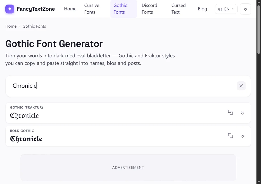
Open the gothic font generator, type your text, and pick the weight: the regular Fraktur for a finer, classic look, or the bold Fraktur for a heavier, more dramatic one. Tap to copy and paste it where you want it — a bio, a display name, a heading. Because the five reused capitals are handled for you, words with C, H, I, R or Z come out complete rather than half-styled.
A couple of habits keep it clean: blackletter capitals are ornate and can be hard to read in a long run, so it works best on short text — a name or a few words rather than a sentence. And as always, glance at the result on another device if it is going somewhere public, since an older phone may show boxes where your screen shows elegant letters. Keep a plain version of anything that has to be typed or searched.
Now that the style makes sense, the companion guides cover the rest: why blackletter can turn into boxes on some devices, why heavily styled words can read as gibberish or plain text to others, and the Unicode gaps behind letters that refuse to convert. To turn your own text into blackletter in a regular or bold weight, open the gothic font generator.
Those empty boxes are called "tofu". They appear when a device lacks a font for the Unicode characters behind fancy text — here is the full explanation, and how to avoid them.
Small text and superscript come from incomplete Unicode sets — a few letters were simply never encoded. Here is which ones, why, and how a good generator handles the gaps.