Why Does Fancy Text Show Up as Boxes (□)?
Those empty boxes are called "tofu". They appear when a device lacks a font for the Unicode characters behind fancy text — here is the full explanation, and how to avoid them.
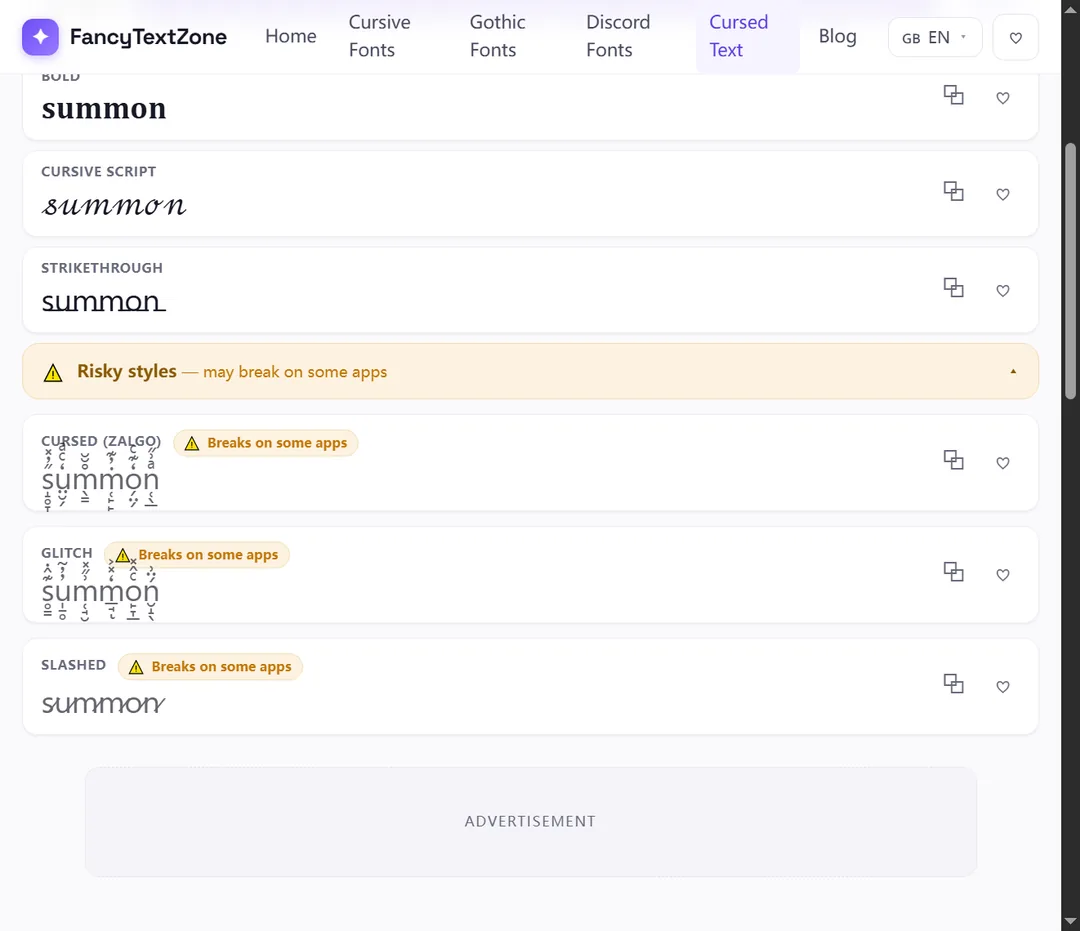
Zalgo text is normal letters with a stack of Unicode combining marks — the accents and diacritics that normally sit on a single letter — piled on dozens deep. It is not a font and not an image: each "glitchy" letter is a base character plus many marks that attach to it, which is what creates the dripping, corrupted look. The same mechanism is why it overflows, gets clipped, or is stripped on some platforms.
Start with one ordinary letter — say "a". Unicode lets you add combining marks to it: an acute accent, a dot below, a tilde, a ring. One mark gives you "á". Zalgo does not stop at one. It bolts on many marks at once, above and below the same letter, so the single "a" sprouts a tower of accents and a beard of marks beneath it. Repeat across every letter and a word looks like it is melting or glitching.
These marks come mostly from the Combining Diacritical Marks block (U+0300–U+036F), plus a few related ranges. Crucially, they are real, standard characters with their own code points — the same building blocks used to write accented languages — just used far beyond their intended dose. So "Zalgo" is not a typeface you install. Like every style on this site, it is plain Unicode characters arranged to look styled, which is also why it pastes anywhere without anyone downloading a thing.
The trick is that combining marks do not take their own space — they stack onto the character before them. The Unicode text-segmentation standard, UAX #29, puts it plainly: "there is never a break between a base character and subsequent nonspacing marks." To the text engine, a base letter and its twenty marks are a single unit (a grapheme cluster), so they render on top of each other rather than side by side.
That is the whole effect. Pile marks that sit above a letter and the text grows an upward tower; pile marks that sit below and it grows downward tendrils; mix both and you get the classic two-way "corrupted" look. The number of marks per letter is exactly what a good generator controls. Our cursed text generator exposes this as a strength slider: low settings add a few marks for a lightly distressed look, high settings stack many for full melt. Nothing random is happening — it is a dial on how many combining characters get appended to each letter.
The same stacking that makes Zalgo also makes it fragile, in three separate ways:
And because each letter is now a base plus many characters, every mark must still find a glyph; on a device with thin font coverage, the gaps show as boxes. Zalgo is the single most boxes-prone style for exactly this reason.
It cannot harm anything. Despite the creepypasta origins of the name, Zalgo is not a virus, not code, and cannot corrupt a post, a file or a database. It is just characters: select them, delete them, and they are gone, exactly like any text. Your own copy of the source is never altered, even when a platform strips the marks on display.
The real risks are social and practical, not technical. Many communities filter it: as covered in our Discord name guide, heavy combining-mark names are commonly removed from member lists or auto-reset by moderation bots, and the stacked characters eat into length limits fast because each visible letter is several code points. It is also genuinely hostile to accessibility — a screen reader tries to announce every mark, turning one word into a stream of accent names, which is part of why fancy text reads as gibberish to others. Use it for visual effect in casual spaces, not in a username, a link, or anything people need to read or hear.
Box risk and filtering both climb with intensity, so the right setting depends on where it lands:
| Where you paste it | How it fares | Why |
|---|---|---|
| Casual chat / messages | Usually fine | Free-text fields render marks; keep strength moderate |
| Social captions & comments | Mostly fine | Accept Unicode; line clipping is the main limit |
| Display names / nicknames | Risky | Length caps + moderation filters trip on heavy stacks |
| @usernames / handles | Never | Plain-character sets only — marks are rejected |
| Bios with fixed line height | Patchy | Tall stacks get cropped or overlap neighbouring lines |
The pattern: the more locked-down and length-limited the field, the lower you should set the strength — or skip Zalgo for a calmer style there.
Open the cursed text generator, type your text, and use the strength slider to set how heavily each letter is stacked. Start low and raise it until the look is right for where it is going — a light setting survives more places than a full melt. Copy the result and paste it into the destination, then read it there rather than trusting the preview, because the receiving app may clamp the marks or clip the line.
A few habits keep it usable: keep a plain version of anything important, since Zalgo cannot be typed by hand; lower the strength for names and bios with tight limits; and if letters show as boxes for other people, the stack is too heavy for their fonts — ease the slider down. If you want a similar broken aesthetic with fewer rendering problems, the glitch text generator leans on a lighter touch of the same combining-mark idea.
Now that the mechanism is clear, the companion guides cover the consequences: why heavy combining styles turn into boxes on some devices, why others may see them as plain text or hear them as gibberish, and the Discord name rules that filter the boldest stacks. To experiment with the strength dial and watch the look build mark by mark, open the cursed text generator.
Those empty boxes are called "tofu". They appear when a device lacks a font for the Unicode characters behind fancy text — here is the full explanation, and how to avoid them.
The same styled text can reach others as boxes, plain letters, or a screen reader reading "mathematical bold a". Here is what is really happening and how to stay readable.